
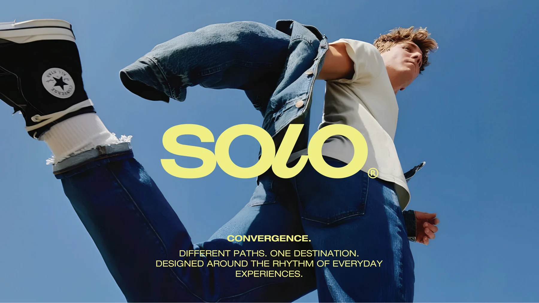
One address. Many reasons.
A brand proposal for a destination bringing retail, offices, and healthcare together in 6th of October. SOLO is positioned as an address people return to throughout their everyday routines.
01 / THE BRIEF
The identity needed to bring three different uses under one recognisable name. The proposal considers how a visit to a clinic, a working day, and a shopping trip can belong to the same destination.
02 / THE IDEA
“One address. Many reasons.” connects the brand to those different reasons for visiting. The idea of convergence gives the destination a shared story without losing the individual experiences within it.
03 / THE IDENTITY
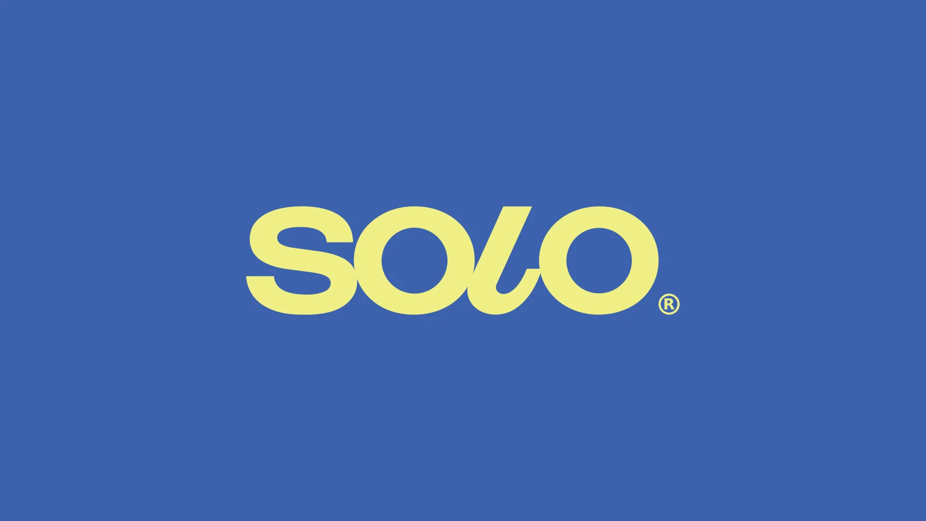
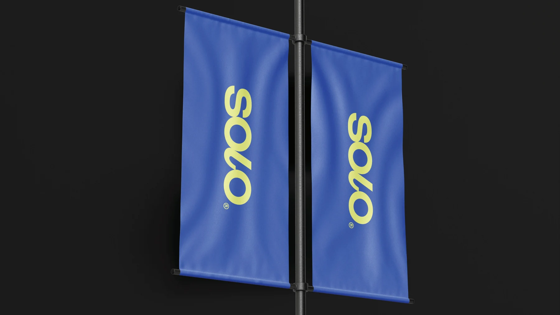
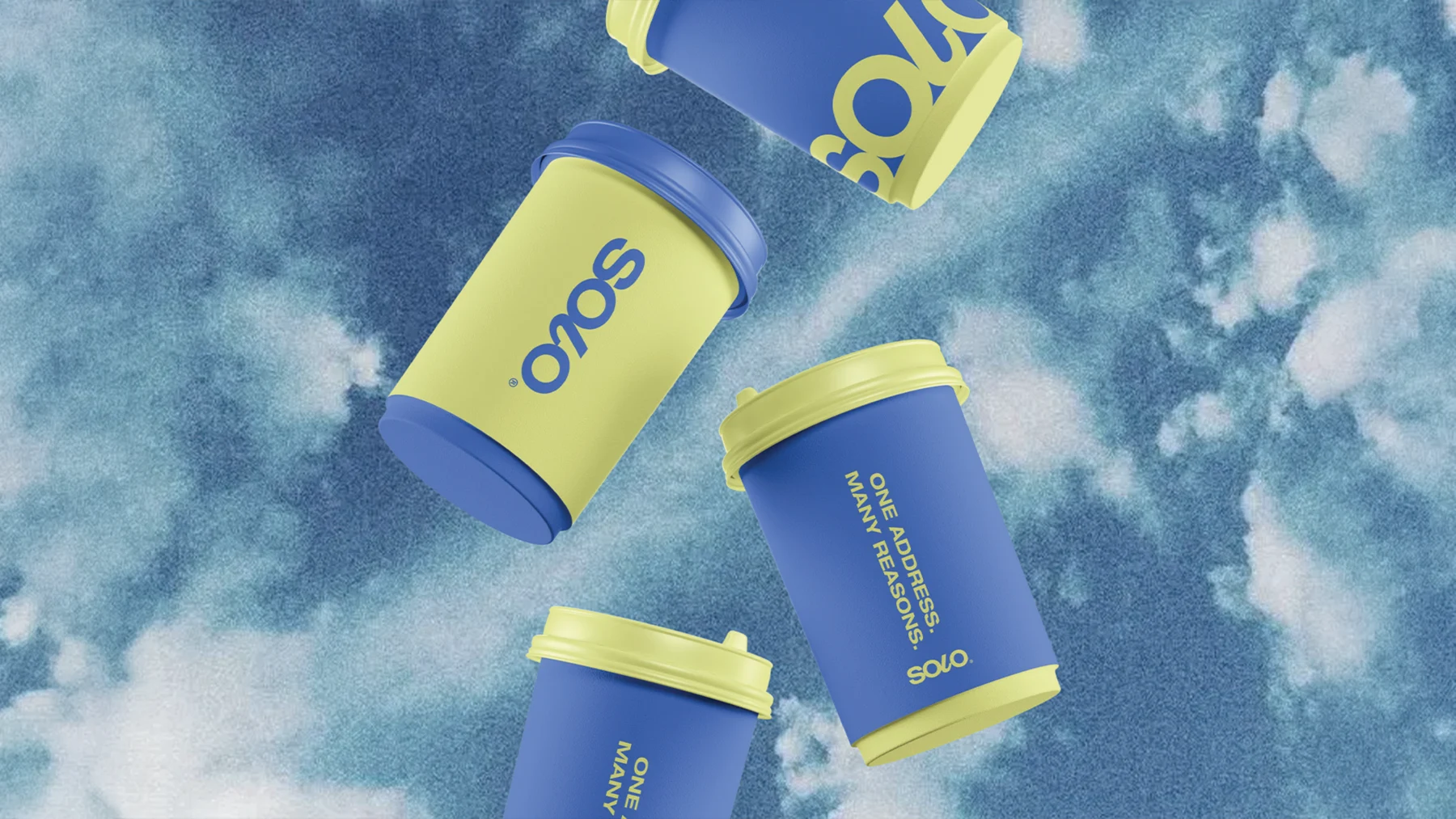
The custom curve in the wordmark’s L introduces movement between otherwise bold letterforms. Blue and yellow lead a lively colour system, supported by orange and cream, with applications across signage, print, merchandise, and outdoor communication.
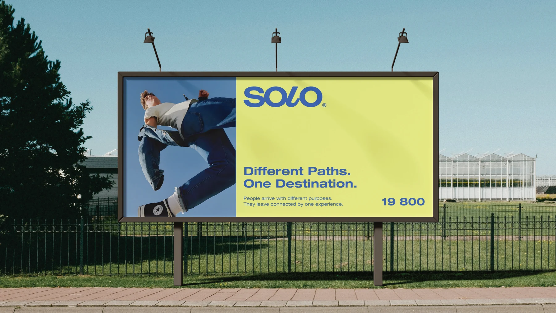
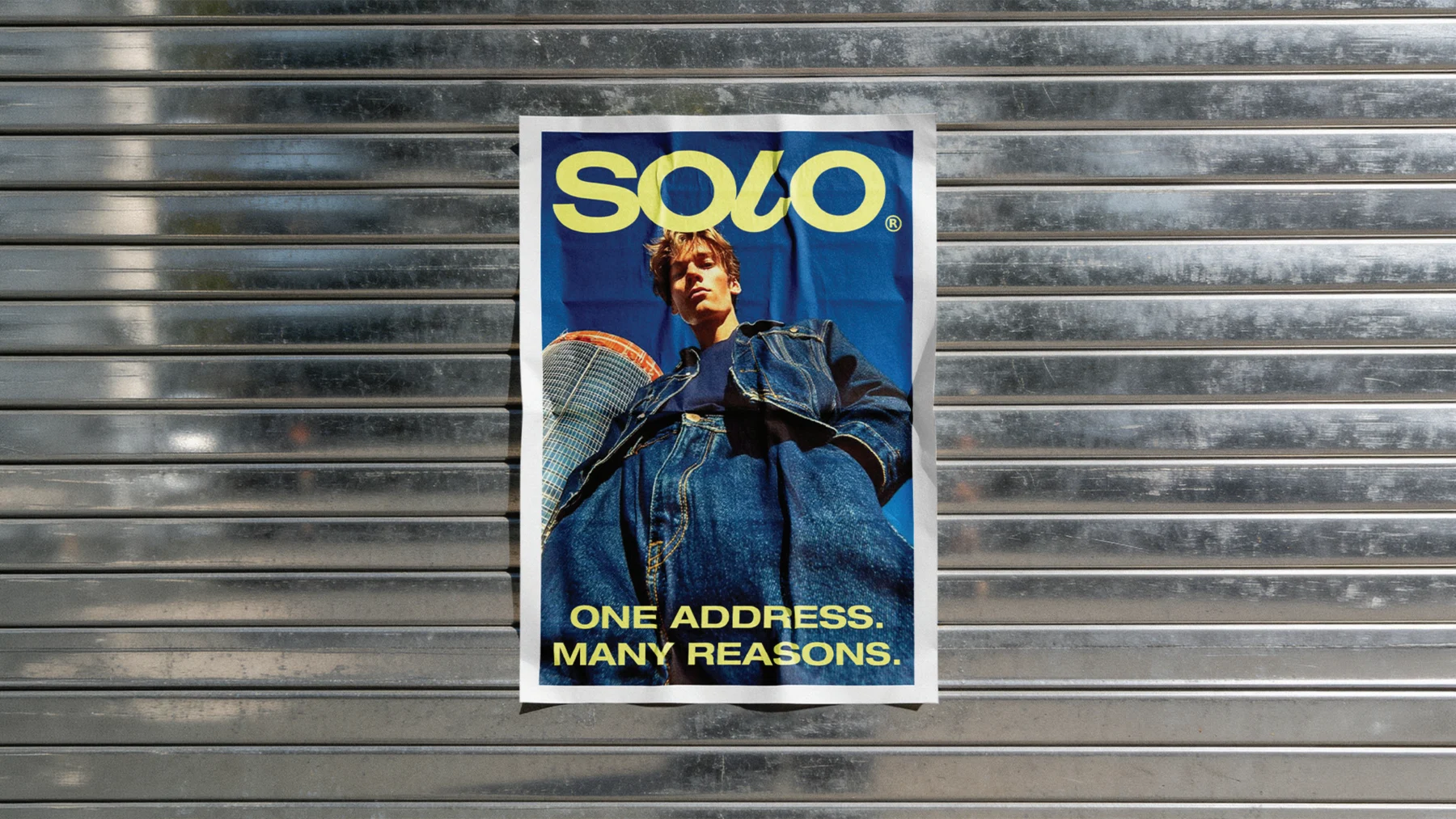
Concept applications from the supplied brand proposal.