An identity with
room for the work.
IEC’s rebrand brings its architecture and engineering practice under one clear signature. The geometric mark gives the identity structure; the restrained palette keeps attention on the projects.
The familiar lime accent is retained. A simpler logo system and defined English and Arabic typography bring consistency across print and digital communication.
Near white
#F7F7F7
Lime
#B5D448
Charcoal
#191919
Typography
Three typefaces, with a defined role for each.
Host Grotesk
Primary

TASA Orbiter
Secondary

Sakkal Majalla
Arabic

The reference
behind the language.
The visual direction draws on quiet architectural images: light across a surface, a carefully framed opening, and the meeting of solid forms. These references establish the mood for IEC’s graphic communication.
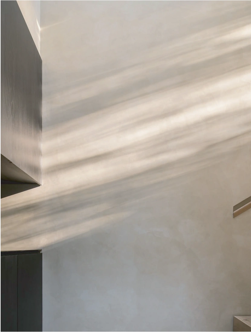
Light
Soft shifts in tone give a flat surface depth.
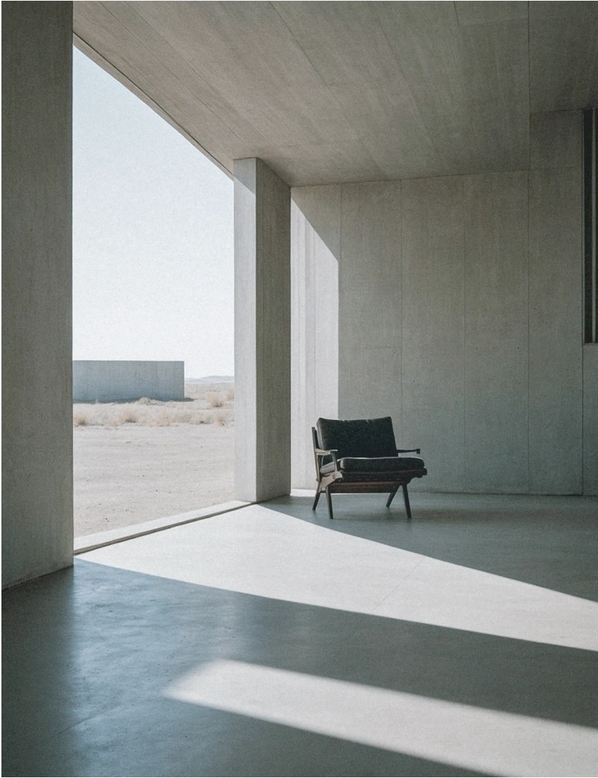
Proportion
Open space and a clear frame keep the composition focused.
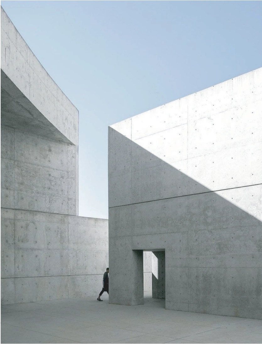
Geometry
Simple planes create structure through their relationship.
Architectural references from the identity moodboard. Shown as visual inspiration, not IEC project work.
Geometry in
every detail.
Circles from the mark frame architectural surfaces. Monochrome imagery gives the social system a consistent tone while keeping the building visible.
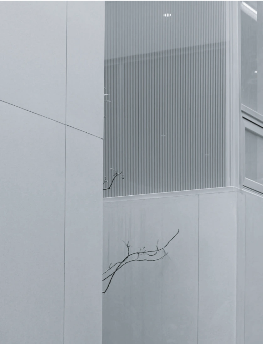
01 / Architectural reference
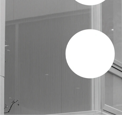
02 / Graphic interpretation